Samsung Electronics is officially halting the sale of home appliances in mainland China, marking a significant shift in its global strategy. Facing intense competition from domestic giants like Hisense and TCL—who now command over 94% of the market—Samsung’s offline presence in key categories like refrigerators and washing machines has dipped below 1%. This move is a calculated response to rising operational costs and a 200 billion Korean won loss in its appliance divisions in 2025. However, this is not a total exit from the region. Instead, Samsung is doubling down on high-tech evolution, refocusing its resources on AI, semiconductors, and medical equipment to align with future growth sectors. In a rapidly maturing market, Samsung is choosing to lead through innovation in advanced industries rather than competing in a saturated consumer landscape.
Arçelik Announces Sale of Stake in Arçelik Hitachi Home Appliances
In a significant move for the global white goods sector, Arçelik has officially signed a definitive agreement with Hitachi Global Life Solutions to sell its stake in their joint venture, Arçelik Hitachi Home Appliances (AHHA).
The Deal at a Glance
The transaction involves a multi-layered financial structure aimed at immediate and long-term returns:
Upfront Cash: Arçelik will receive USD 205 million in cash upon the closing of the deal.
Deferred Payment: An additional USD 56 million will be paid out over a three-year period following the completion of the sale.
Closing Adjustments: The total consideration will also include 60% of AHHA’s existing cash that exceeds USD 56 million at the time of closing.
Strategic Refocus
This exit marks a pivotal shift in Arçelik’s broader corporate strategy. By divesting its stake in the joint venture, the company is prioritizing portfolio optimization and doubling down on its core markets.
Industry analysts view this as a targeted effort toward long-term value creation, allowing Arçelik to streamline operations and invest more aggressively in the regions and product categories where it holds the strongest competitive advantage.
As the global appliance landscape continues to consolidate and evolve, this move highlights how major players are refining their international footprints to remain lean and focused on sustainable growth.
Homa at the 139th Canton Fair

This edition of the Fair carried particular significance.
Fresh from receiving an IF Design Award for Homa Design Magazine and launching Issue No. 8, Homa demonstrated once again that its ambitions extend far beyond manufacturing. The company is shaping the broader conversation around refrigeration innovation, design culture and the future direction of the global Major Domestic Appliances (MDA) industry.
Every year, millions of refrigerators and cooling appliances produced within Homa’s advanced manufacturing ecosystem enter homes across the world. These products — built on a foundation of quality, innovation and long-term industrial reliability — reach consumers through partnerships with many of the most respected global appliance brands.
Why do these brands continue to choose Homa?
Because the expectations of buyers searching for refrigerator manufacturers in China have evolved. Cost efficiency alone is no longer the deciding factor. Today’s partners seek innovation capability, industrial stability, food preservation expertise, design culture and strategic, long-term collaboration.
Homa represents this new generation of China-based refrigeration manufacturing: globally connected, design-driven and innovation-oriented.
This is the space where Homa continues to expand its role — evolving from a high-performance appliance manufacturer into a global platform for refrigeration innovation, OEM collaboration and product development.
At the Canton Fair, this evolution took physical form. More than an exhibition stand, Homa’s booth — introduced this year as The Homa Squares — became a genuine meeting point for the global appliance ecosystem. Retailers, distributors, sourcing managers, OEM partners, designers, product developers and industry leaders gathered not only to conduct business, but to exchange perspectives, explore market shifts and discuss the future of refrigerators, freezers and cooling appliances.
The idea behind The Homa Squares emerged from a simple but powerful insight: throughout history, the world’s great squares have never been merely physical spaces. They are cultural stages — places where people meet, ideas circulate and new directions take shape.
Homa brought that spirit to the Canton Fair, transforming its presence into a space for dialogue, discovery and shared vision — a reflection of the company’s growing influence in the global white goods landscape
Elica’s Virtus Oven Line Wins Red Dot Award 2026 for Product Design
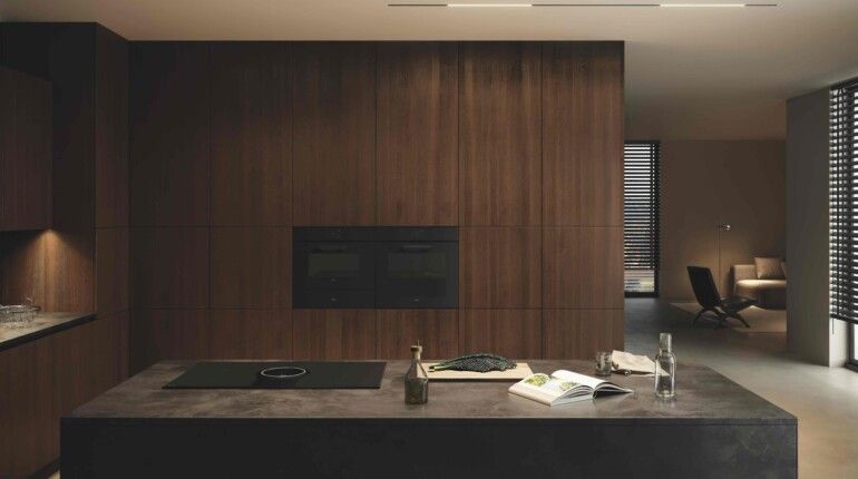
Elica has once again been recognised on the world stage, with the Virtus oven line winning the Red Dot Award 2026 – Product Design in the Kitchen and Household category. The achievement strengthens Elica’s position as one of the most design‑driven brands in the built‑in cooking sector, continuing a trajectory that consistently blends architectural styling with advanced performance.
The Red Dot Award remains one of the most influential international design competitions, judged annually by an independent panel of global experts. Products are evaluated on innovation, aesthetic quality, functionality, and the ability to elevate everyday use through thoughtful design. Winning in the Product Design category signals that the Virtus line not only meets these criteria but stands out among hundreds of global submissions.
Elica’s Virtus ovens reflect the brand’s ongoing commitment to refined materials, intuitive interfaces, and a cohesive design language that aligns with modern kitchen architecture. The Red Dot jury’s recognition highlights the continuity of Elica’s design philosophy — one that prioritises clarity, precision, and a premium user experience.
For Elica, the 2026 award reinforces a long‑term design path that continues to resonate with both consumers and the wider design community, further cementing its role in shaping the future of cooking appliances.

Electrolux to Cut 3,000 Jobs as Global Restructuring Accelerates
Electrolux Group has announced one of its most far‑reaching restructuring programmes in years, confirming plans to cut 3,000 jobs worldwide over the next two years. The move comes as the company battles weak demand, rising costs, and intensifying competition across key global markets.
The cuts span Europe, North America, and Latin America, signalling a deep strategic shift in how the Swedish manufacturer intends to operate in a rapidly changing appliance landscape.
—
Major Reductions Across Key Markets
Italy: 1,700 Jobs Cut — 40% of Workforce
Electrolux will eliminate around 1,700 positions in Italy, representing nearly 40% of its national workforce.
The plan includes:
– Closure of the Cerreto d’Esi kitchen hood factory
– Workforce reductions across all remaining Italian sites
This marks one of the most significant industrial restructurings in Italy’s appliance sector in recent years.
—
United States: Over 1,000 Jobs Lost in South Carolina
More than 1,000 roles will be cut at the Anderson County, South Carolina plant.
The facility will phase out refrigeration production by July 2026, following Electrolux’s new manufacturing partnership with Midea—a move that shifts production strategy toward cost‑competitive sourcing.
—
Hungary: Jászberény Factory to Close
Electrolux will shut down its Jászberény refrigeration plant by the end of 2026, affecting roughly 600 employees.
The closure is part of a broader effort to consolidate production and reduce fixed costs across Europe.
—
Chile: Additional Plant Closure
The company has also confirmed a previously announced plant closure in Chile, continuing its global footprint optimisation.
—
Why Electrolux Is Restructuring Now
The company’s aggressive cost‑cutting follows a surprise operating loss in early 2026. Several pressures converged:
– Intense market competition
Lower‑priced Asian manufacturers and strong North American rivals have eroded margins.
– Demand slump in the U.S.
The U.S. accounts for one‑third of Electrolux Group sales, making the downturn especially damaging.
– Rising operational and tariff costs
Higher production expenses and U.S. import tariffs have squeezed profitability.
In response, Electrolux is shifting its portfolio toward premium appliances and higher‑value categories, aiming to stabilise earnings and rebuild competitiveness.
—
What This Means for the Global Appliance Industry
Electrolux’s restructuring underscores a broader trend reshaping the white goods sector:
– Manufacturing is consolidating into fewer, more efficient sites
– Partnerships with Asian OEMs are becoming more common
– Premiumisation is increasingly seen as the path to profitability
– Labour-intensive plants in Europe and the U.S. face mounting pressure
For suppliers, retailers, and competitors, the message is clear: the global appliance market is entering a new phase defined by cost discipline, strategic alliances, and sharper product segmentation.
The High Cost of Home Cooking: Study Reveals the “Hidden” Price of Gas Stoves
A new study out of New Zealand is shedding light on the true cost of gas stove usage, and it isn’t just showing up on your utility bill. Commissioned by the nation’s Energy Efficiency and Conservation Authority, the research adds significant weight to the growing concerns regarding the respiratory and economic impacts of gas-powered kitchens.
Beyond the Flame: Health Risks
While we’ve known for some time that gas stoves are linked to adverse health outcomes, this study reinforces the severity of those risks. Common issues associated with indoor gas combustion include:
Increased Childhood Asthma: A primary concern for families with young children.
Higher Hospitalization Rates: Respiratory distress leading to emergency care.
Premature Mortality: Long-term exposure linked to shortened lifespans.
The $5,000 “Hidden” Bill
What sets this study apart is its attempt to quantify the “economic burden” of these health risks. Researchers calculated the financial impact of medical treatments, lost productivity, and long-term care associated with stove-related illnesses.
After adjusting for inflation and converting to 2025 U.S. dollars, the study concluded that a typical household using a gas stove carries an average annual health-related economic burden of $5,258
Charlotte Green has been appointed CEO of BSH UK & Ireland.
Charlotte Green has been appointed CEO of BSH UK & Ireland.
Charlotte will be taking up the role from September 2026 and joins from Amazon, where she spent 15 years building and leading large, multi-market operations across the UK and Europe.
On joining BSH, Charlotte said: “I have long admired BSH and its brands, both as a consumer and from within the industry, so it is a privilege to be joining the company at such an exciting time.
“I’m looking forward to working with the team to build on the strong foundations already in place, strengthen our position across the UK and Ireland, and continue building close relationships with customers, consumers and trade partners

Electrolux Confirms 1,700 Job Cuts Across Italy as Cerreto D’Esi Plant Closes
Electrolux has formally notified unions of 1,700 redundancies across its Italian operations—a restructuring move that affects nearly half of its 4,000‑strong national workforce.
The reductions span the group’s major manufacturing hubs in Porcia (Pordenone), Susegana (Treviso), Forlì, and Solaro (Milan). In the most significant site‑level change, the Cerreto D’Esi plant—home to 170 employees—will be closed entirely.
Production Lines to Be Halted
As part of the restructuring plan, Electrolux will cease washer‑dryer production in Porcia and halt hob manufacturing in Forlì. These shutdowns mark a substantial shift in the company’s Italian industrial footprint and follow months of pressure from weak demand, rising costs, and intensifying global competition.
Union Engagement Underway
Unions have been briefed on the scale of the cuts, with formal negotiations expected to focus on safeguarding remaining operations, securing support measures for affected workers, and clarifying Electrolux’s long‑term industrial strategy in Italy.
The announcement adds to a growing list of European manufacturing adjustments across the sector, as appliance makers continue to recalibrate capacity in response to structural market challenges.
Whirlpool Suspends Dividend After Q1 Loss as Demand Slumps and Prices Rise
Whirlpool Corporation has suspended its quarterly dividend for the first time in 55 years, a significant move that underscores the depth of the challenges facing the world’s largest major appliance manufacturer.
The decision follows a steep first‑quarter loss and comes alongside the company’s largest price increase in more than a decade, as Whirlpool responds to what management describes as recession‑level demand conditions.
Executives linked the downturn to a combination of macroeconomic shocks, weakened consumer confidence, and global instability — including disruption tied to the Iran war — all of which have contributed to a sharp contraction in appliance demand across key markets.
To stabilise performance, Whirlpool is pairing its price actions with accelerated cost‑reduction measures. These initiatives, which the company says will “materially reshape” its operating structure, also shift Whirlpool’s risk–reward profile for investors at a time when the sector is already navigating prolonged demand softness.
For the appliance industry, Whirlpool’s dividend suspension marks one of the clearest signals yet of the pressure facing global manufacturers as they balance inflation, supply‑chain volatility, and a consumer market still struggling to recover
Dreame Expands Smart Home Line‑Up With New L9 Laundry Pair and P‑Wind 10 Portable Air Conditioner
Founded in 2017, Dreame Technology remains the youngest of the major players driving innovation in the smart‑home sector. The brand continues its rapid ecosystem expansion with the launch of four new products, led by the AI‑powered L9 washer‑dryer series and the P‑Wind 10 portable air conditioner.
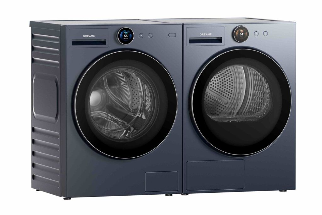
Dreame AI Inverter L9 Washing Machine
AI‑Optimised Washing Performance
The L9 washing machine uses Dreame’s intelligent washing algorithm to analyse load weight, soil level and fabric type in real time. It automatically adjusts water flow, drum rhythm and detergent usage to deliver cleaner results while reducing waste.
High‑Efficiency Inverter Motor
A premium inverter motor ensures stable, quiet operation with improved energy efficiency. The motor’s precise speed control enhances stain removal and protects delicate garments, while contributing to a longer appliance lifespan.
Fabric‑Care Focused Drum Design
The L9’s drum features a gentle, protective pattern designed to reduce friction and prevent fibre damage. Combined with AI‑controlled wash actions, it supports better garment care across everyday loads and specialist cycles.
Smart Connectivity and Convenience
Wi‑Fi control via the Dreame app allows users to start, pause and monitor cycles remotely, receive maintenance alerts and access tailored wash programmes. A large, intuitive display and streamlined interface make the machine easy to operate for all household members.
Dreame AI Twin Inverter L9 Dryer
Twin Inverter Heat Pump Drying
The L9 dryer combines an inverter motor, inverter compressor and high‑flow fan to deliver powerful yet fabric‑friendly drying. Low‑temperature heat‑pump technology supports 30‑minute fast drying, reduced noise and lower energy consumption.
AI‑Driven Drying Precision
Temperature and humidity sensors track moisture levels throughout the cycle, enabling the AI Drying Algorithm to stop at the ideal moment — preventing overdrying and protecting fabrics.
PressFree Steam Care
A dedicated steam‑refresh programme smooths creases in 25 minutes, reducing the need for manual ironing.
User‑Centric Design
Three drying outcomes — Cupboard Dry, Ready to Wear and Iron Dry — plus a four‑layer filtration system support cleaner air and better garment care. A premium TFT display knob elevates the user experience.
—
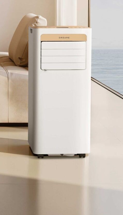
Dreame P‑Wind 10 Portable Air Conditioner
3‑in‑1 Climate Control
The P‑Wind 10 combines cooling, dehumidification and ventilation in one compact unit, making it suitable for year‑round comfort.
3D Airflow for Even Cooling
Automatic horizontal oscillation and adjustable airflow direction help distribute cool air evenly throughout the room.
Compact, Space‑Saving Design
At 305 × 285 × 700 mm, the P‑Wind 10 fits neatly into bedrooms, studies and small living spaces.
Easy Installation and Smart Operation
Four swivel casters and a simple three‑step assembly process make setup straightforward. Users can control the unit via the LED display, remote control, Wi‑Fi or the Dreame app. A 24‑hour timer and sleep mode support quieter night‑time use.
Available in black and camel.


